
OVERVIEW
In this 3 week-long project, we were addressing the challenges of improving the online shopping experience for Amazon.com.
Based on solid research findings, we reshaped the navigation bar, adjusted the position of the order logistics information and the return & replacement entrance, and redesigned the product details page, which together solved the main problems on the current version.
TEAM
Jinhui Yu(Robbie)
Arthur Qian
MY ROLE
-
Interview
-
Visual Design
-
Usability Test
Problem
With the start of my new life studying abroad in the US, I have a lot of things to buy for my new home. I bought most of my home appliances and furniture on Amazon because it is the largest e-commerce marketplace. However, I ran into all sorts of issues while using it: confusing search results, hard-to-find order details, uncertain refunds, and more.
Solution
Based on user research, I learned that the main needs of Amazon users are to find products more quickly, to track order status more intuitively, and to have a more beautiful and concise interface design; so I decided to redesign the Amazon app for these three parts.

Research
In order to ensure that the problems I encountered were not individual cases, and to find more design flaws and pain points that bothered other consumers, I conducted research.
1. Background research:

I carefully browsed all the main pages of Amazon and tried a lot of functions. Meanwhile, I also carefully studied some of Amazon's major competitors' apps in the market to compare their differences in functionality and vision. Personally, compared with Target and Walmart, Amazon's layout is indeed more chaotic and its visual design is more outdated.

Current Amazon App

Walmart
Best Buy
Uber Eats
Target
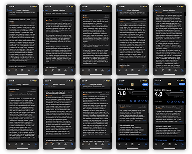
I then studied the Amazon App Store page and carefully checked the popular comments. I found some interesting findings. Some comments have the same ideas as me, but also some problems I have never encountered. Like: useless filters, web-like UI, and reload & flash back to white screen, and so on.
Poor and outdated UI
Hard to track order, no delivered notification

Not friendly as
the web version
Terrible customer
service
Cannot get refund and cancel my order
What are the filters, and why offer filters if they dont work
Results unrelated
Broken transaction
and always reload
Suddenly flash to white screen
Search is awful
Reviews in AppStote
2. User Interview & Usability Test:
To better understand the current shopping experience at the Amazon.com app and gain in-depth insight into how users shop in the app, we conducted user interviews and usability tests.
We interviewed two female RPI students, two male RPI students, two male professors, two female professors, and two school logistics personnel, one male and one female. They all shop online about once a week.

During the usability test, we formed empathy with interviewees by observing how they complete specific tasks set by us, eg. :
1
-
Look for specific products: Look for National Geographic: Tut's Treatures 100 years Later
-
Check the logistics information of a purchased item: find out how long it will take for Amazon essential sweaters in transit to arrive
-
Refund a specific item: return the arrived AirPods case
1
sensing their emotions and asking questions to understand the reason behind it, through which we also took notes about important findings and flashed design ideas.


Interview script & Usability test

3. Survey - Questionnaire:
Based on the design flaws collected in the usability test, we used the questionnaires to obtain relevant quantitative data, and determine the priority of the design goals according to the numbers of related mentioned problems.
Our design will address three issues:

How to make logistic information more conspicuous
How to make search results more relevant & efficient
How to make layout make sense to most users

Key Pain Points & Key Insights
4. User Persona:
According to the user pain points obtained our from user research, combined with the common user behavior patterns we observed in interviews and usability tests, we summarized and made user personas to guide our subsequent design work.


Ideation & Iteration

Using wireframes, I gathered a group of users and conducted two rounds of usability testing. The test included a series of operational tasks mentioned earlier. During the test, I recorded the problems and confusions encountered by the participants and discovered opportunities.
The findings from this test were valuable as I refined the user experience, iterated on the design, and ensured that the final product more effectively met user needs.


